Strategy + identityDesign + printingNationwide USA shippingBilingual service
Two ways to grow your brand
From the concept that sets you apart to the packaging your customers hold.
01 / Branding
Branding for restaurants and food products
We build complete brand concepts for restaurants, beverages, and food products: strategy, naming, logo, visual language, and applications built to look professional, consistent, and ready to grow.
Clear processes. Brands that make it into the real world.
★★★★★5.0/5Featured client rating
★★★★★ 5/5
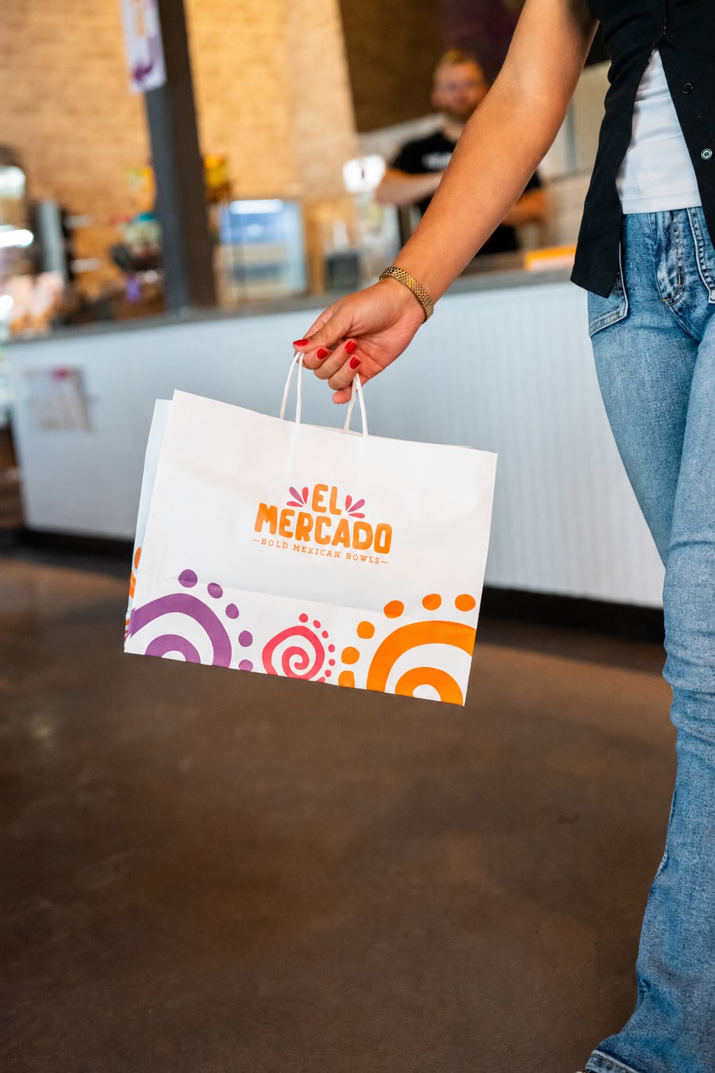
“What we liked most was seeing the identity work in real life. The team understood the concept, paid attention to every detail, and made the packaging feel like a true part of El Mercado rather than something added at the end.”
★★★★★ 5/5
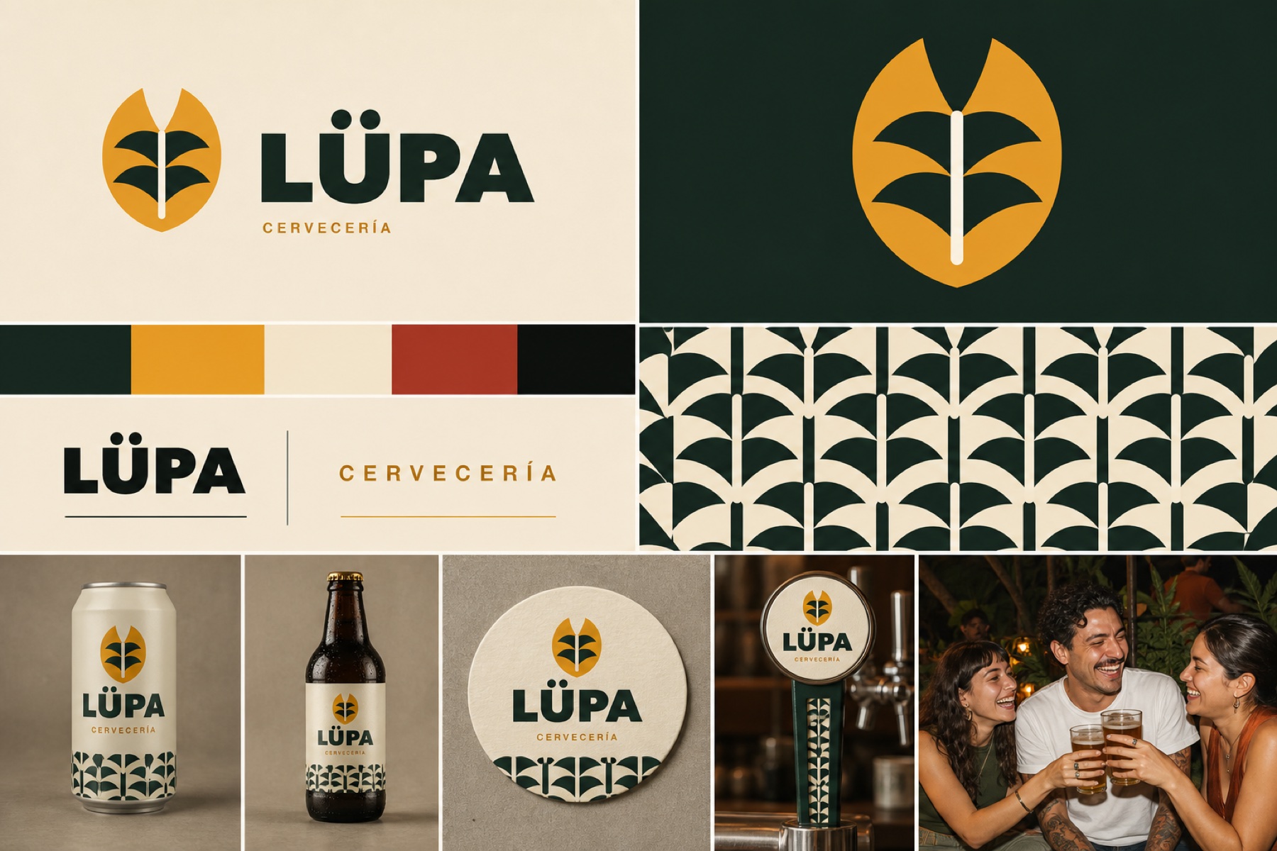
“We wanted a beer brand that felt different and had room to grow. Brandazzo gave the concept a clear direction, from the symbol to the applications, and the final result feels professional without losing personality.”
★★★★★ 5/5
“Brandazzo understood from the beginning that we didn’t just need a logo—we needed a brand that would work throughout the restaurant and across every package. The process was organized, communication was consistent, and the result went beyond what we originally had in mind.”
★★★★★ 5/5
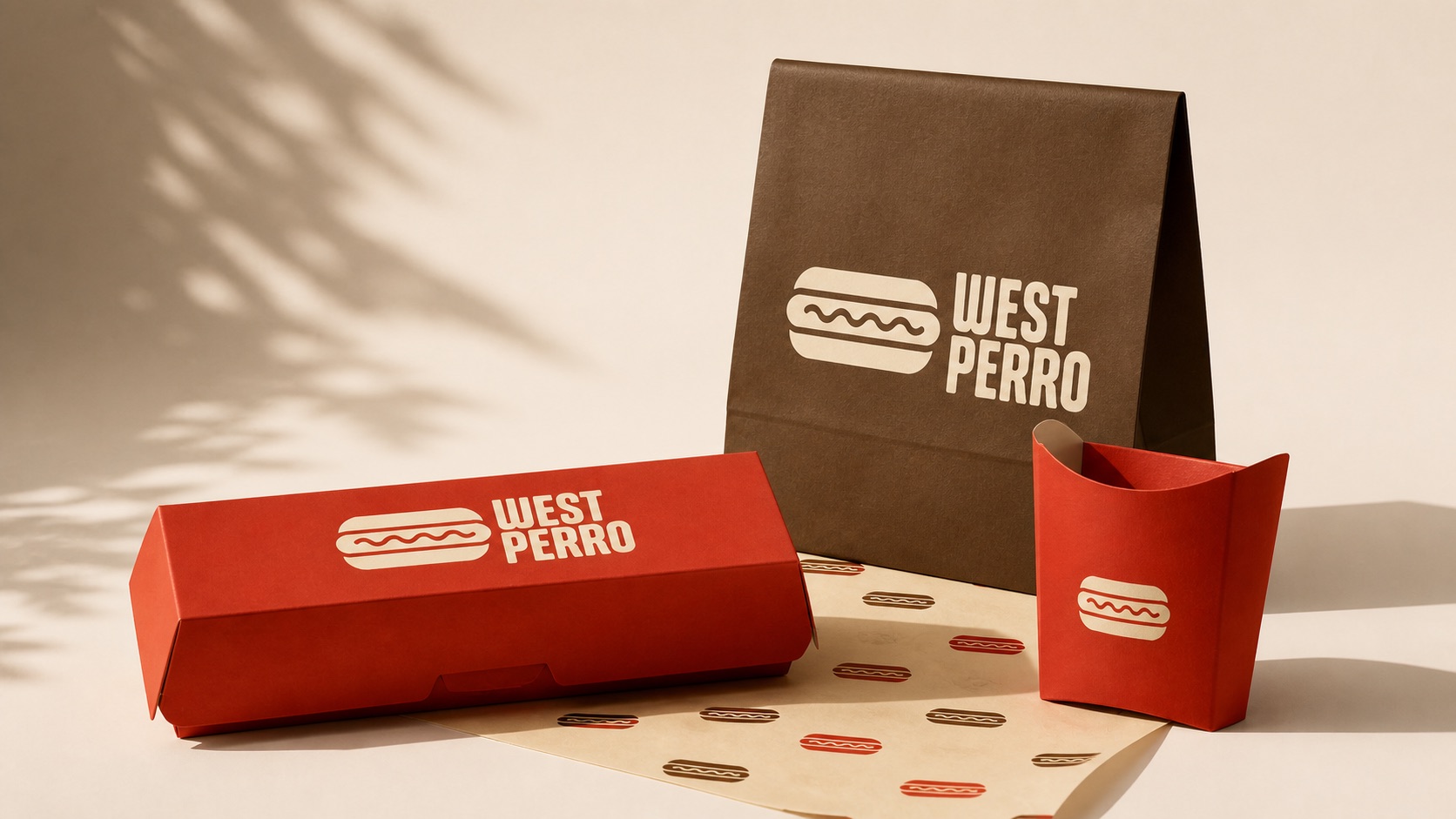
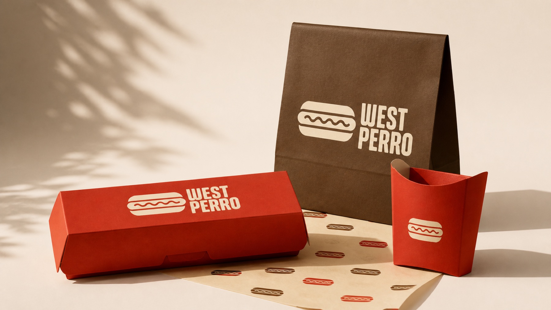
“We wanted a hot dog brand that felt at home in Los Angeles while keeping a Latin personality. Brandazzo found that balance and then carried the identity into the cups, bags, boxes, and everything else we needed to operate.”
★★★★★ 5/5
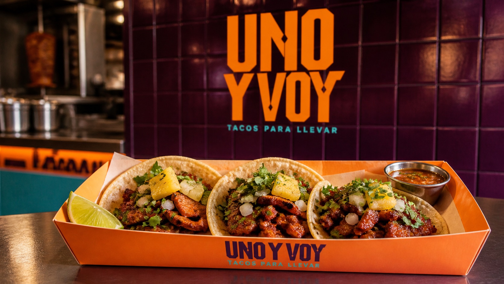
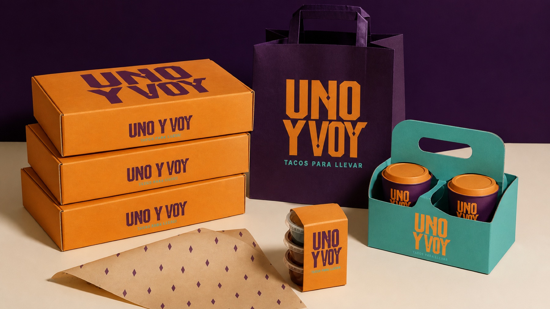
“We appreciated that they avoided the usual Mexican visual clichés. They found a more urban, original way to represent the concept, and the system works very well both inside the restaurant and for takeout.”
★★★★★ 5/5
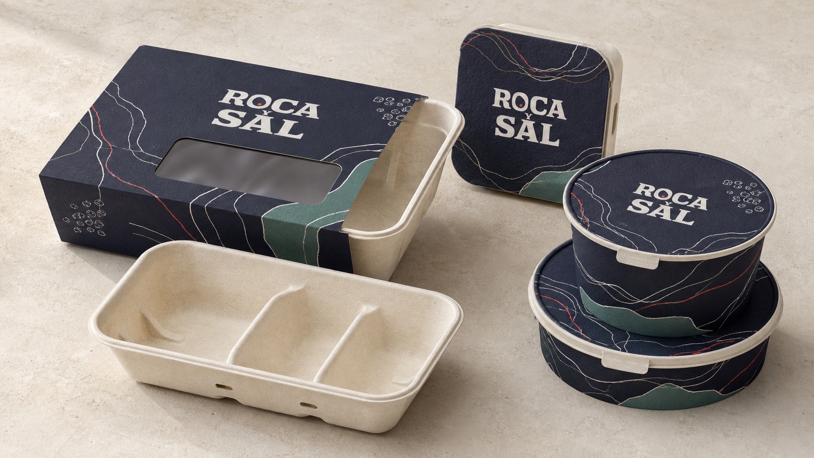
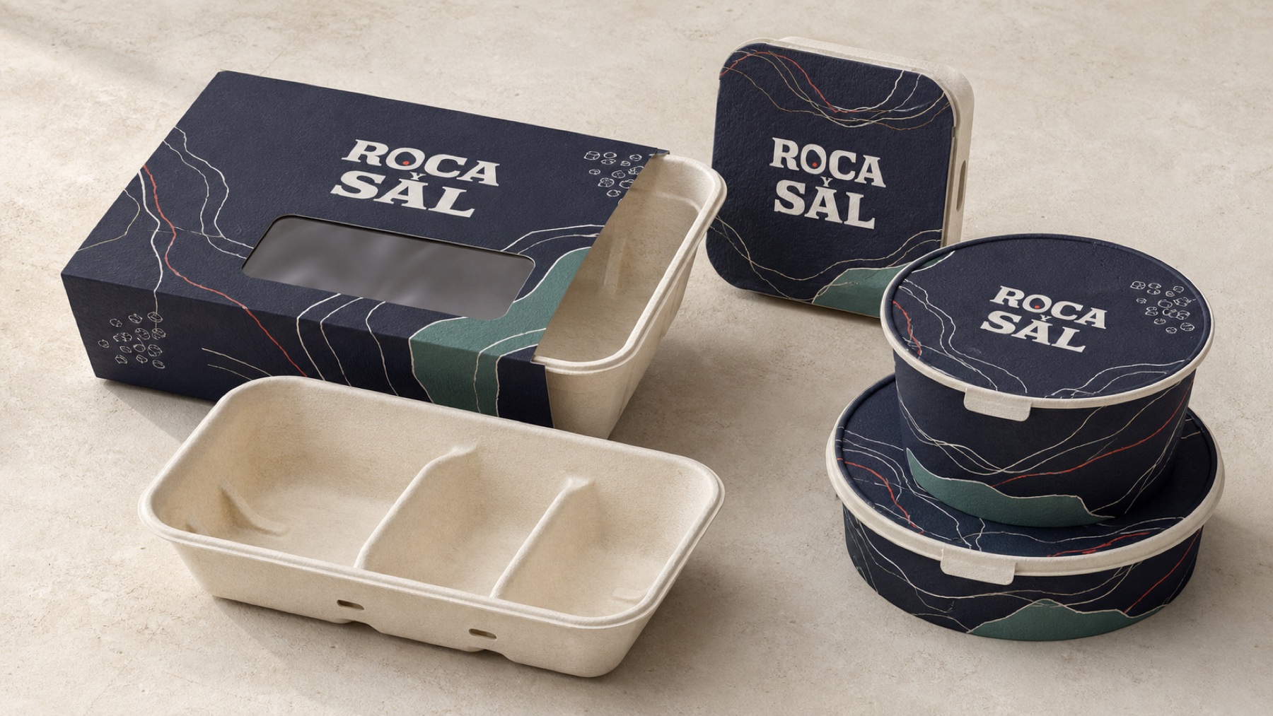
“What we valued most was the consistency. Each package has its own composition, but everything still feels unmistakably Roca y Sal. The result looks professional and much more considered.”
★★★★★ 5/5
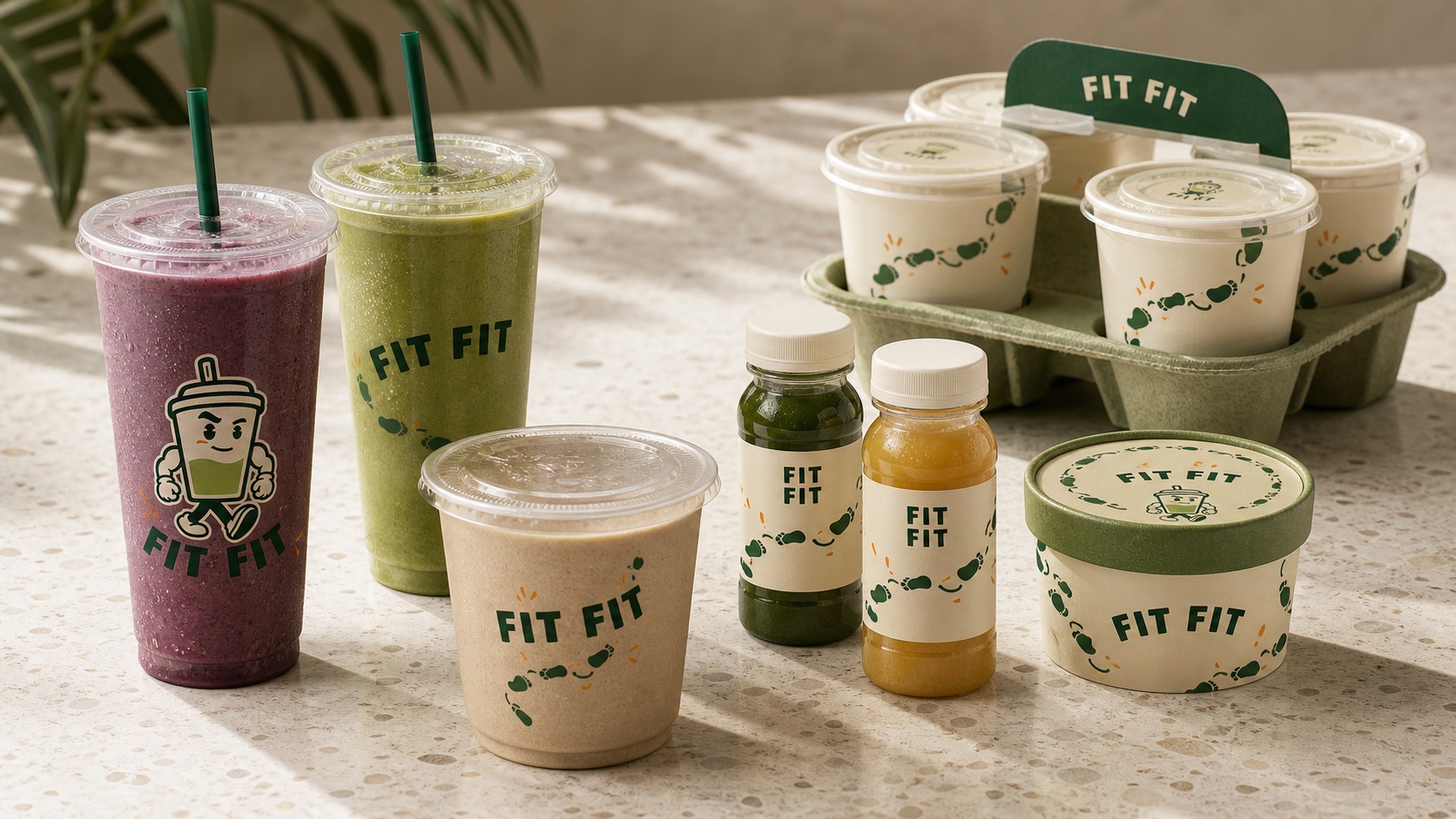
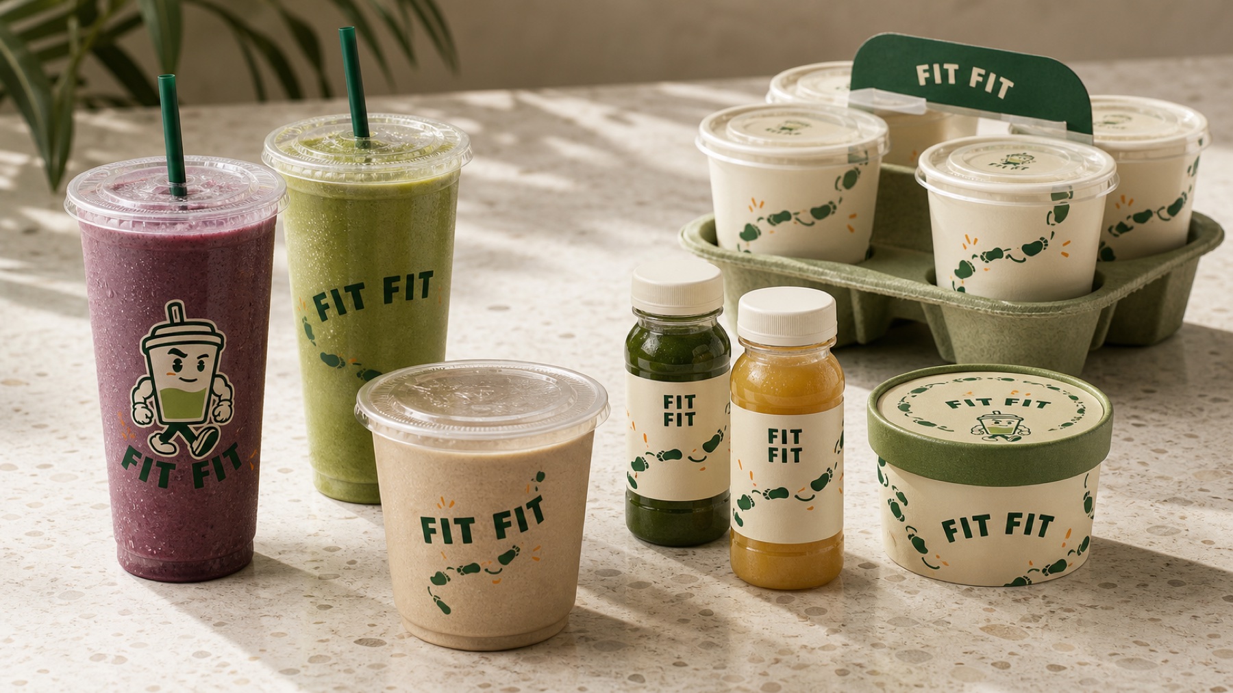
“The team made Fit Fit feel fun and professional at the same time. The mascot has personality, but the brand does not depend on it alone; the entire system feels ready to grow.”
★★★★★ 5/5
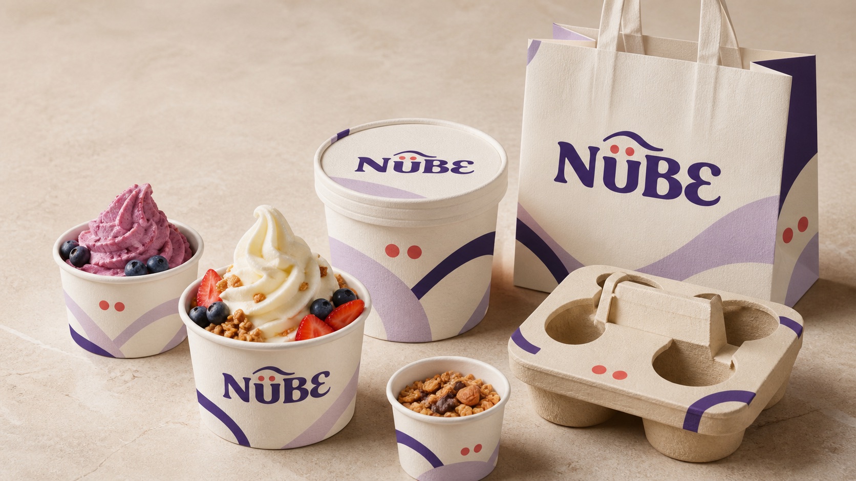
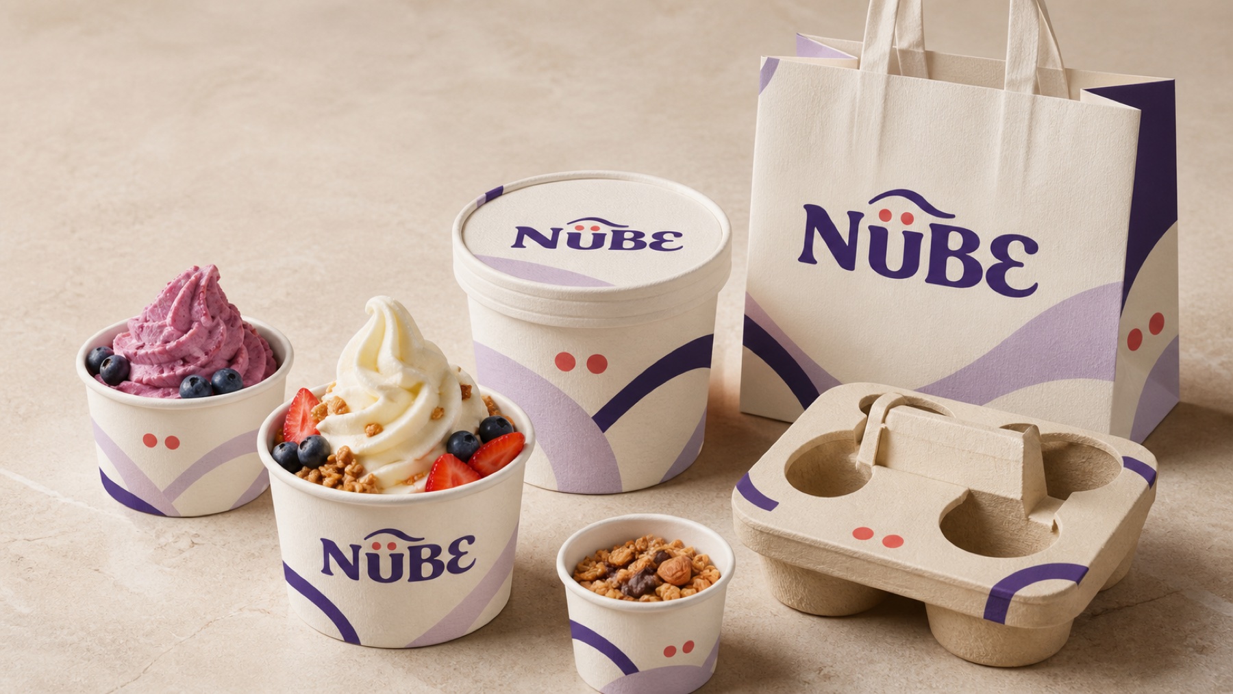
“We really liked how they carried the Nübe idea across every package. The cups, bags, and carriers feel connected, while each piece still has enough personality to work on its own.”
★★★★★ 5/5
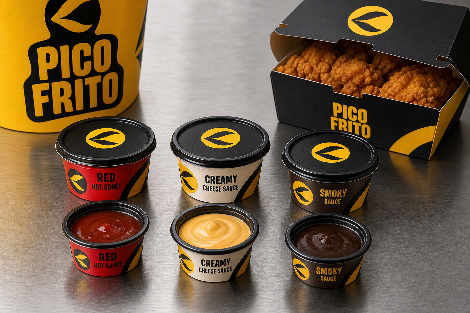
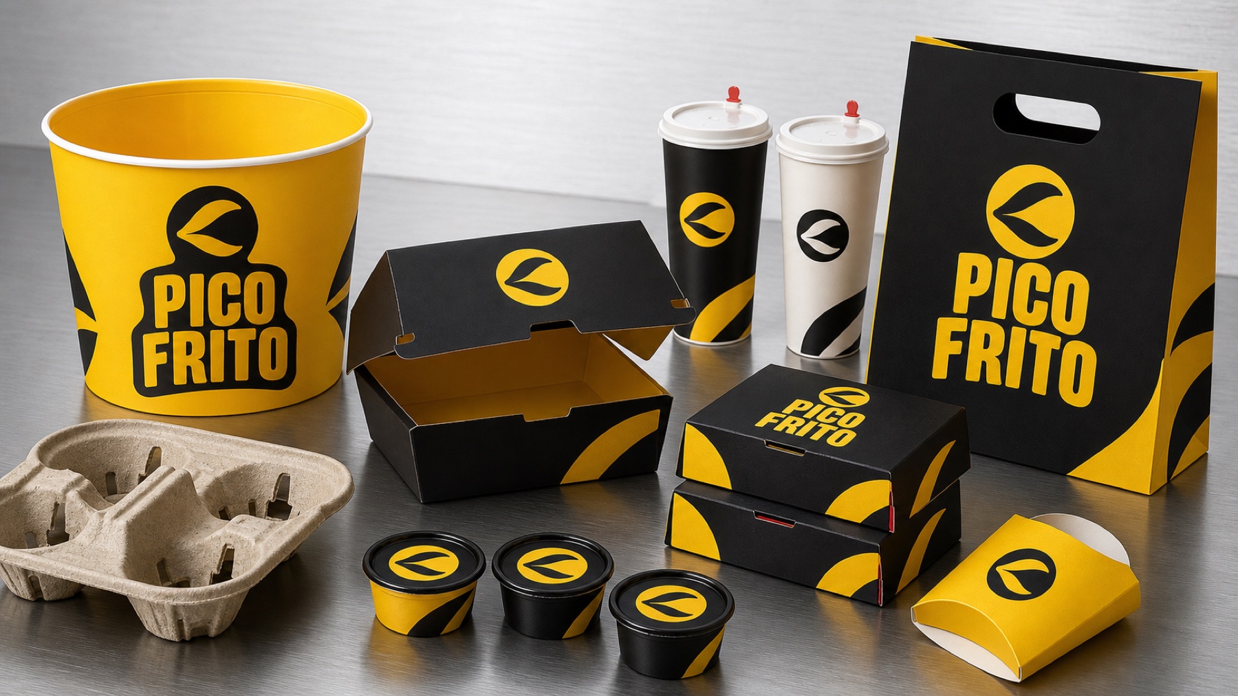
“The Pico Frito system works because every piece has the same visual strength: buckets, boxes, cups, and even the sauces. The brand is recognized quickly and feels different from other options in the category.”
★★★★★ 5/5
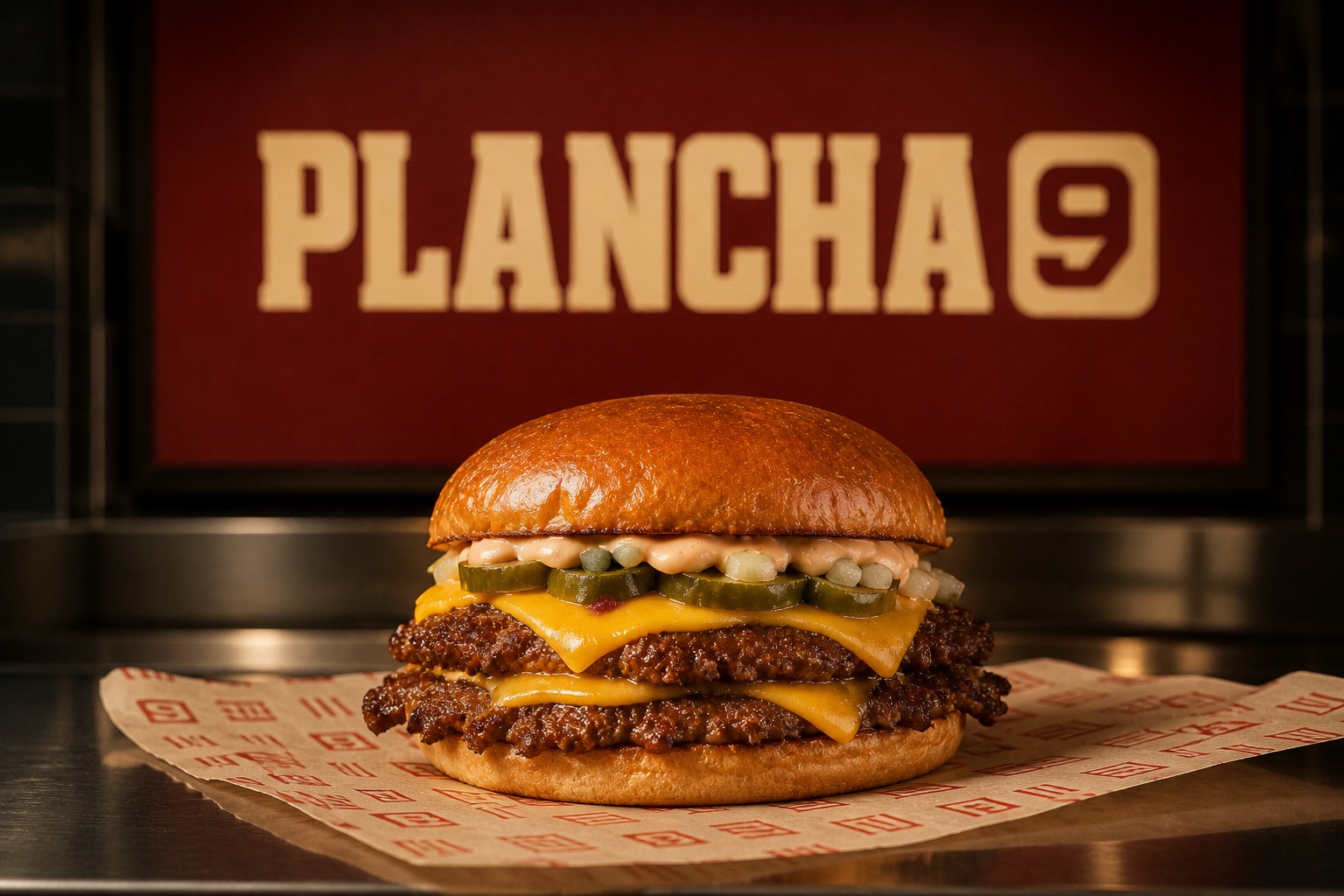
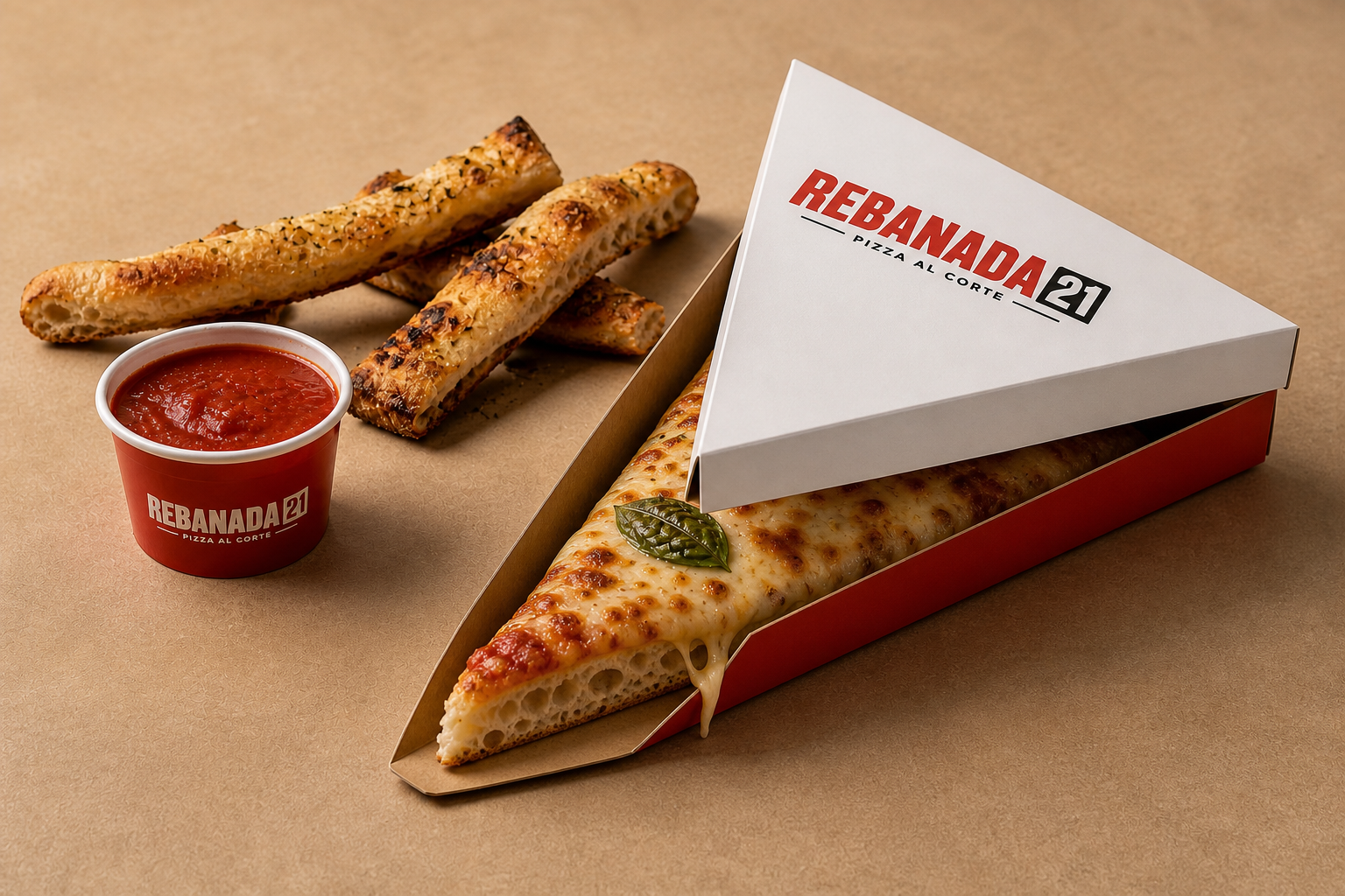
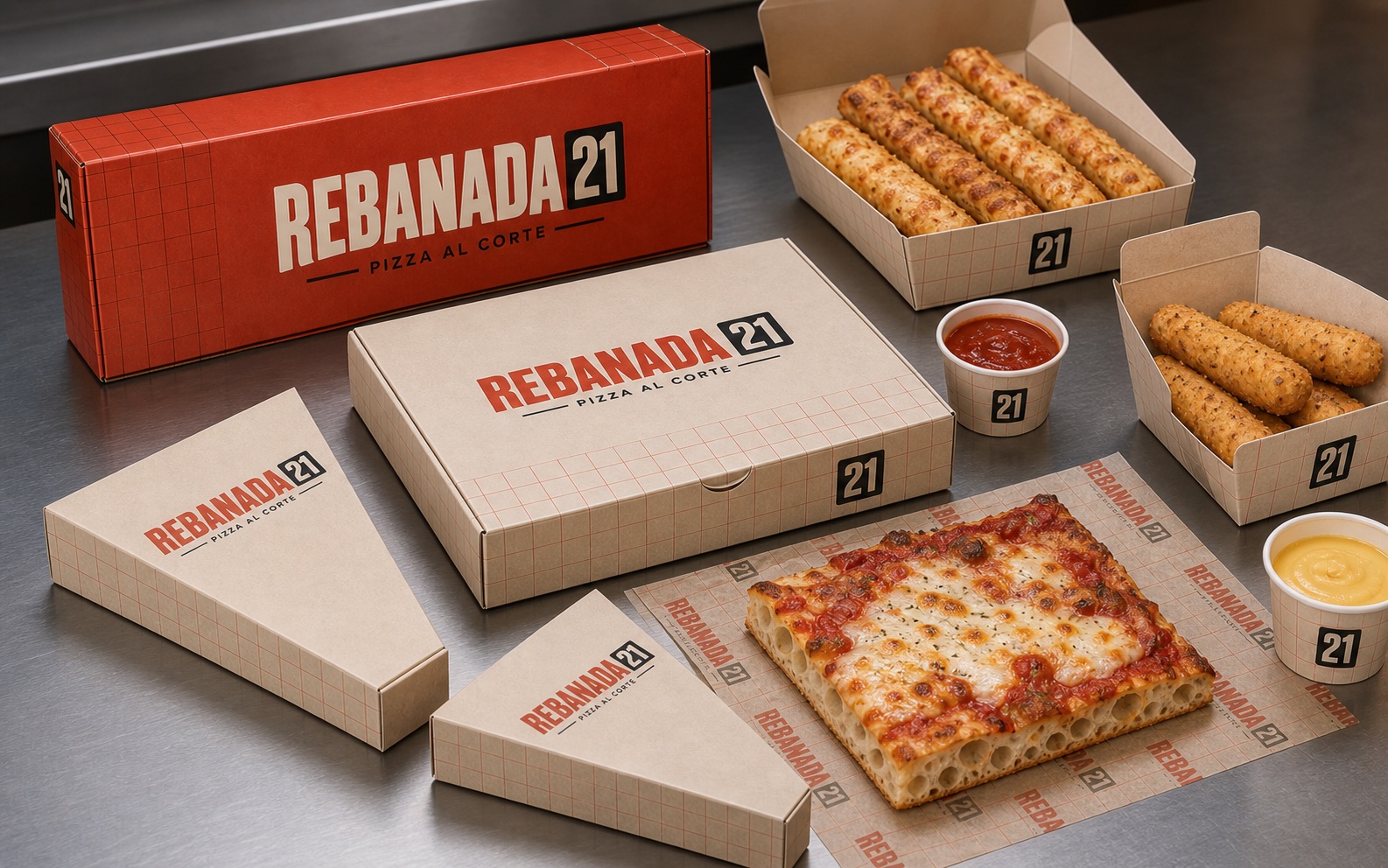
“Rebanada 21 ended up with a clear, urban personality. We especially liked that the design adapted to each packaging format without losing the number, the color, or the presence of the brand.”
★★★★★ 5/5
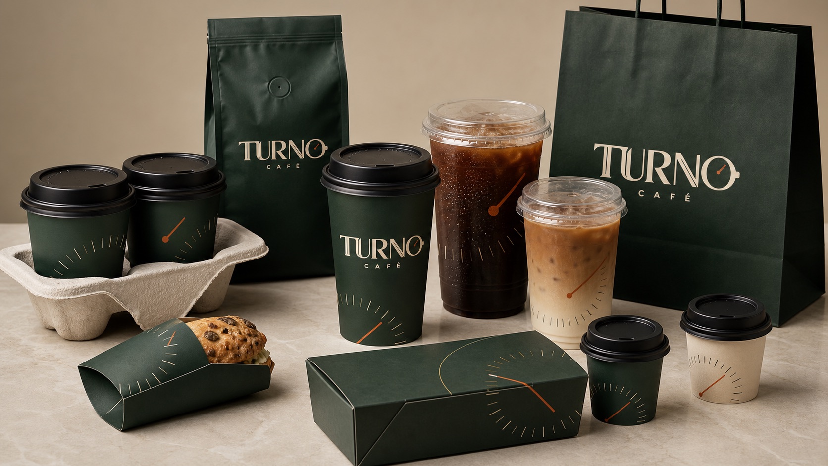
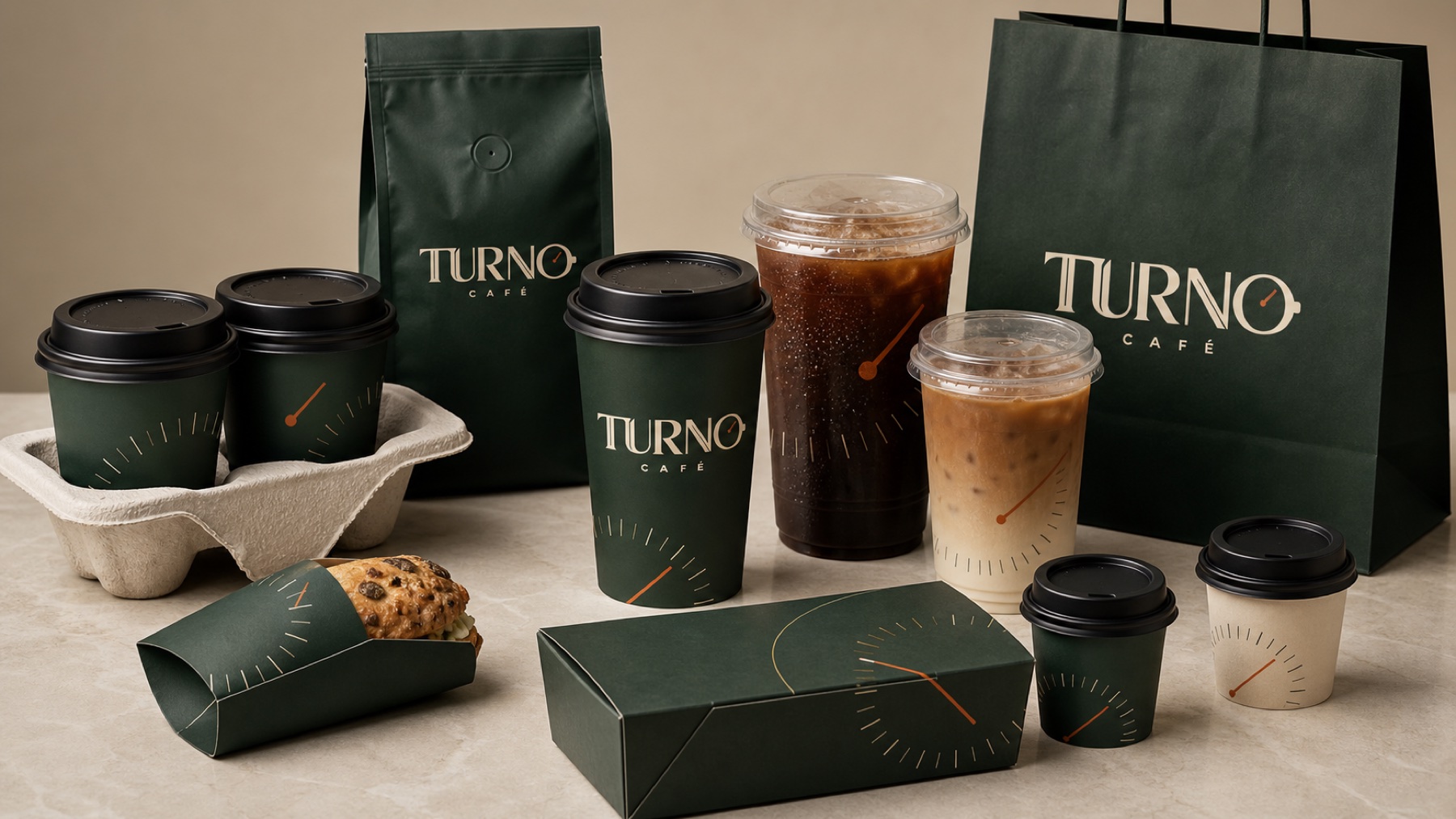
“Brandazzo made every customer touchpoint speak the same language. From cups to the bar and uniforms, everything feels like part of Turno Café rather than a collection of separate pieces.”
★★★★★ 5/5
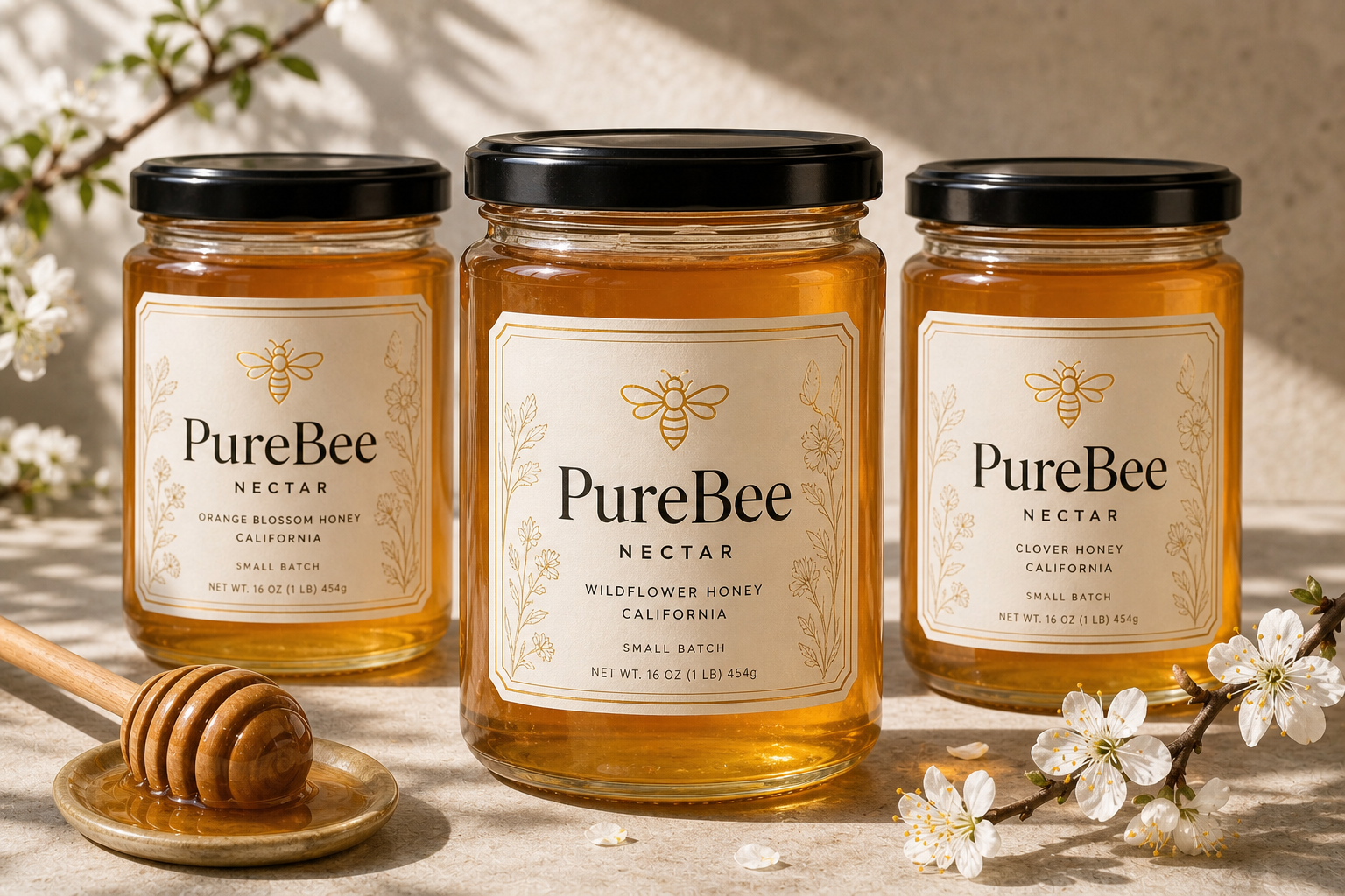
“The result feels elegant while still communicating nature and provenance. We liked that they treated the identity as a system that can grow with new honey varieties rather than as a single isolated label.”
★★★★★ 5/5
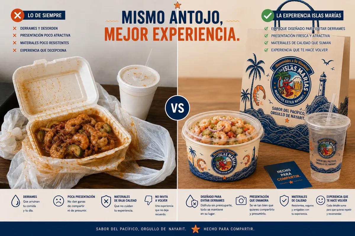
“Before the project, the food went out in packaging that did not represent the brand and could create a messy experience. The new system improves presentation, protects the food, and makes every order immediately recognizable.”
★★★★★ 5/5
“We appreciated that each format was designed around how it is actually used in the restaurant. It is not the same artwork repeated everywhere; every package is properly resolved while the brand remains instantly recognizable.”
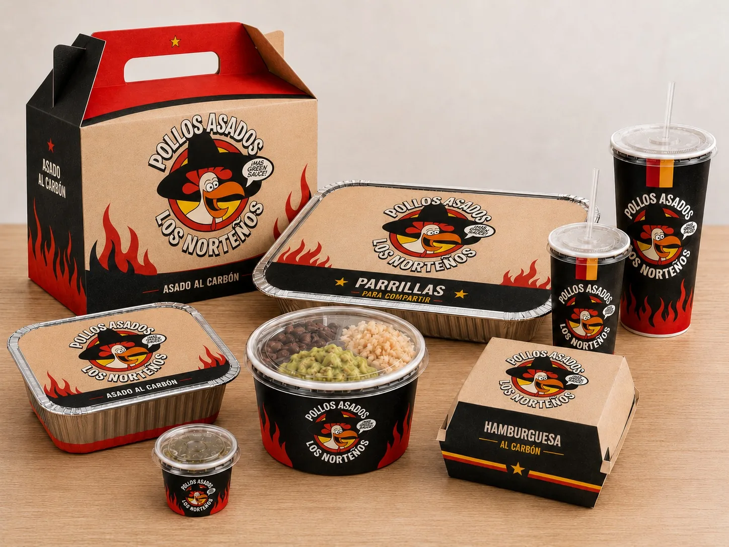
Restaurant packaging
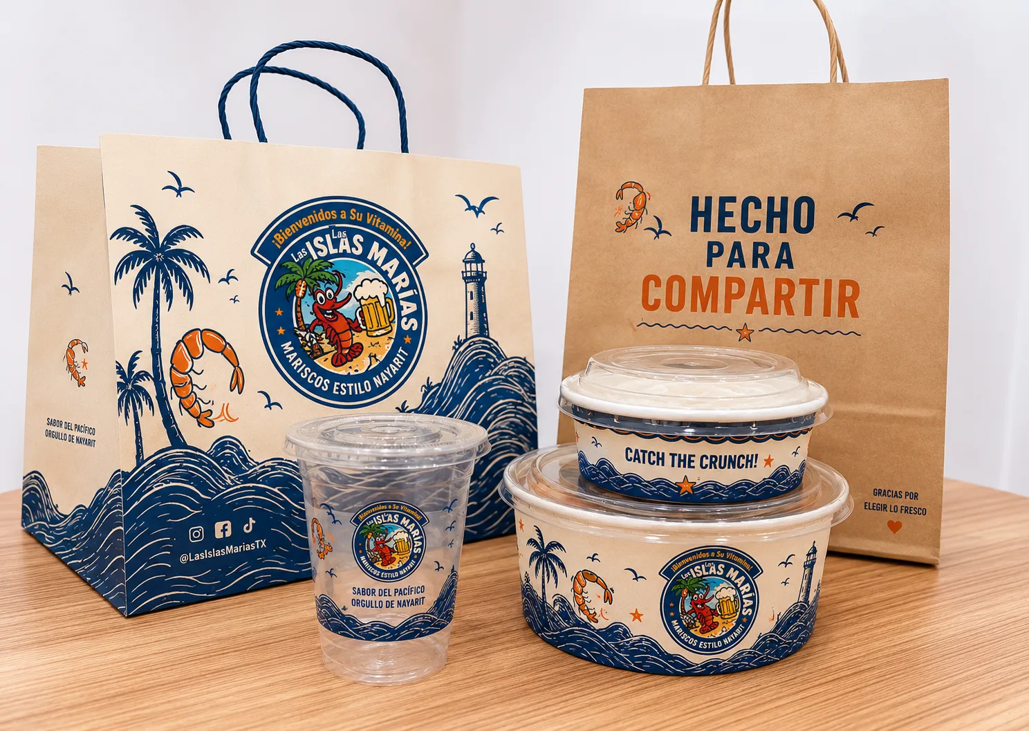
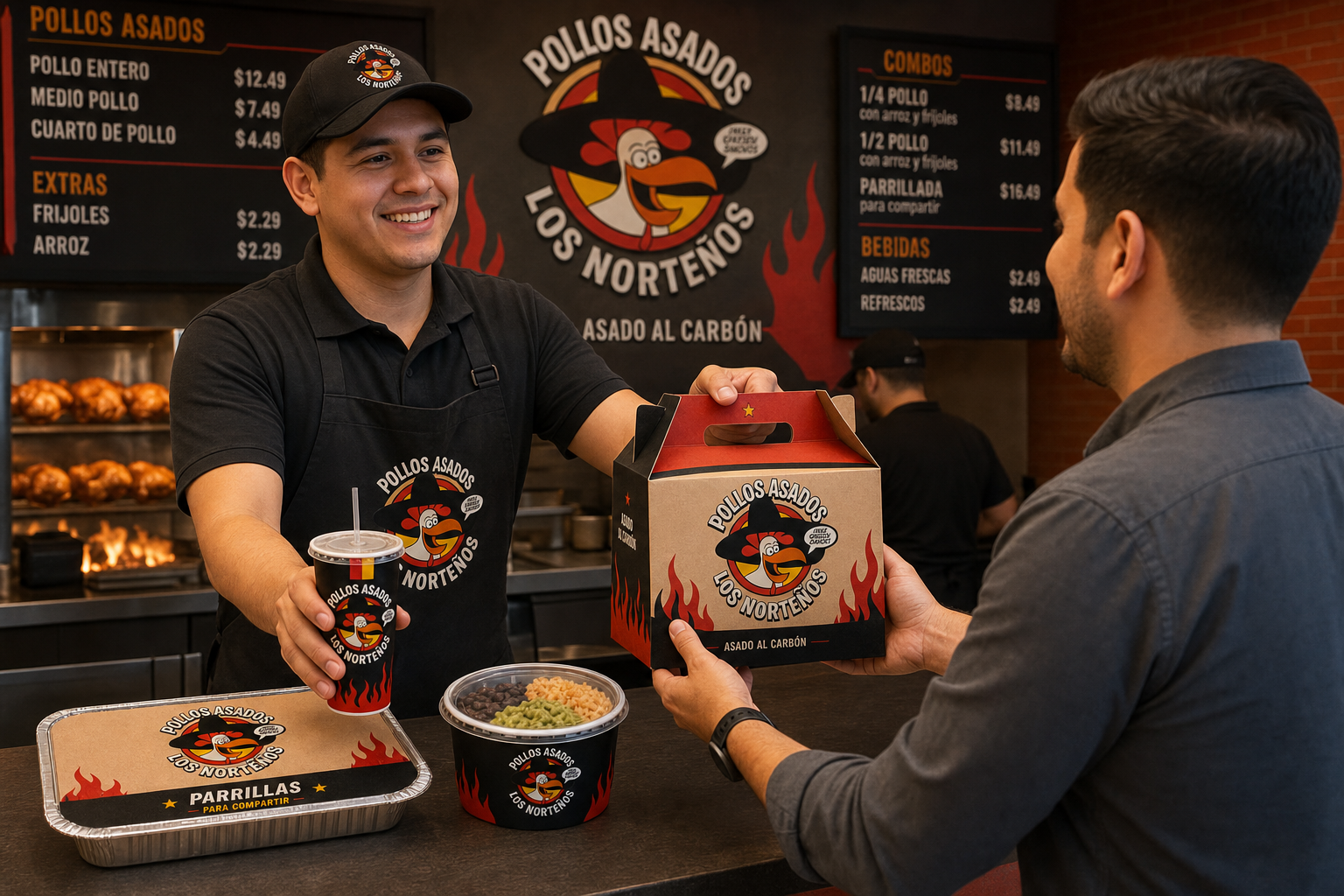
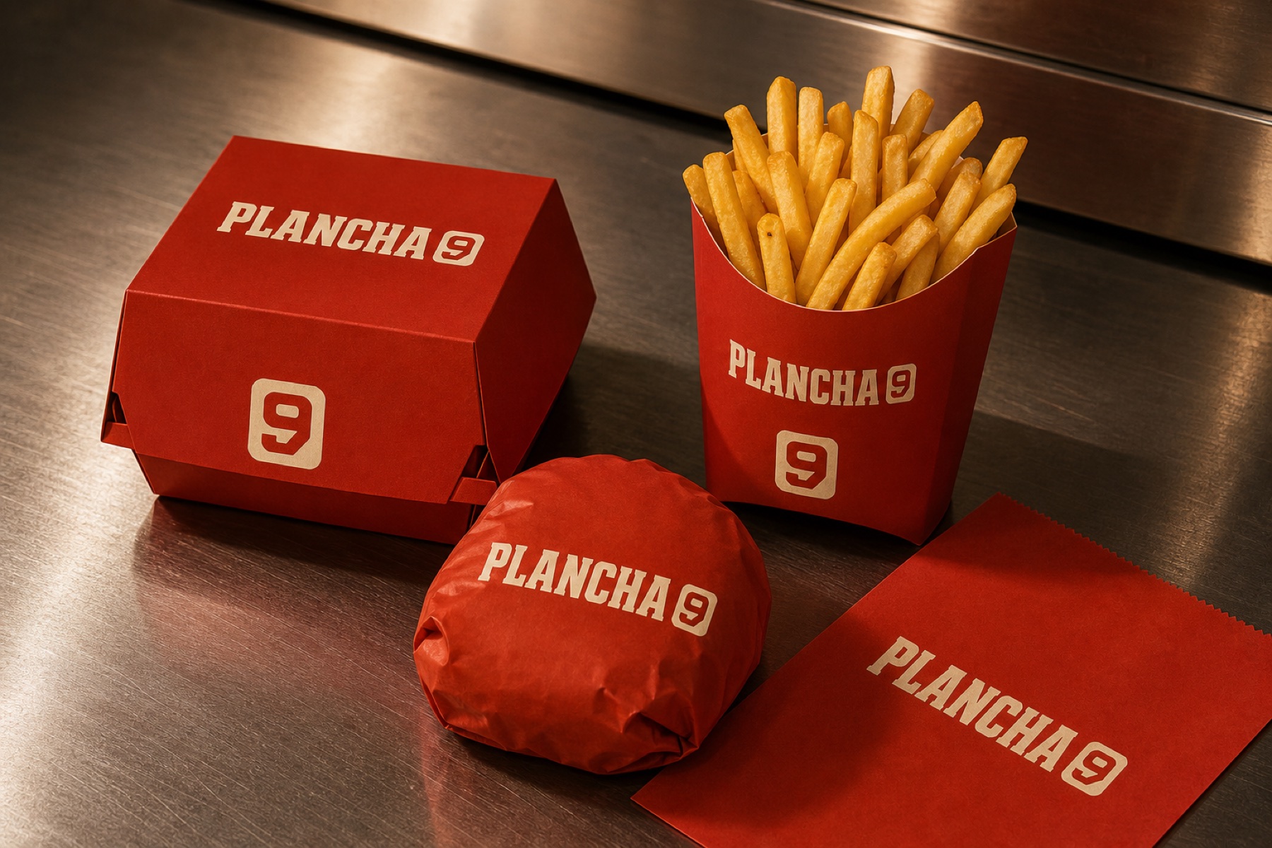
We design the experience that leaves through the door.
Boxes, cups, bags, and delivery systems where branding is not added at the end. It begins with the package, is prepared for print, and ships across the United States.